Nimlok Brand Refresh + Identity System
-
Creative Direction & Brand Leadership
-
Nimlok
-
Experiential Marketing / Tradeshow & Events
-
Brand Refresh
-
Visual identity refresh + brand system rollout
-
Internal stakeholders, freelance designer (concept support)
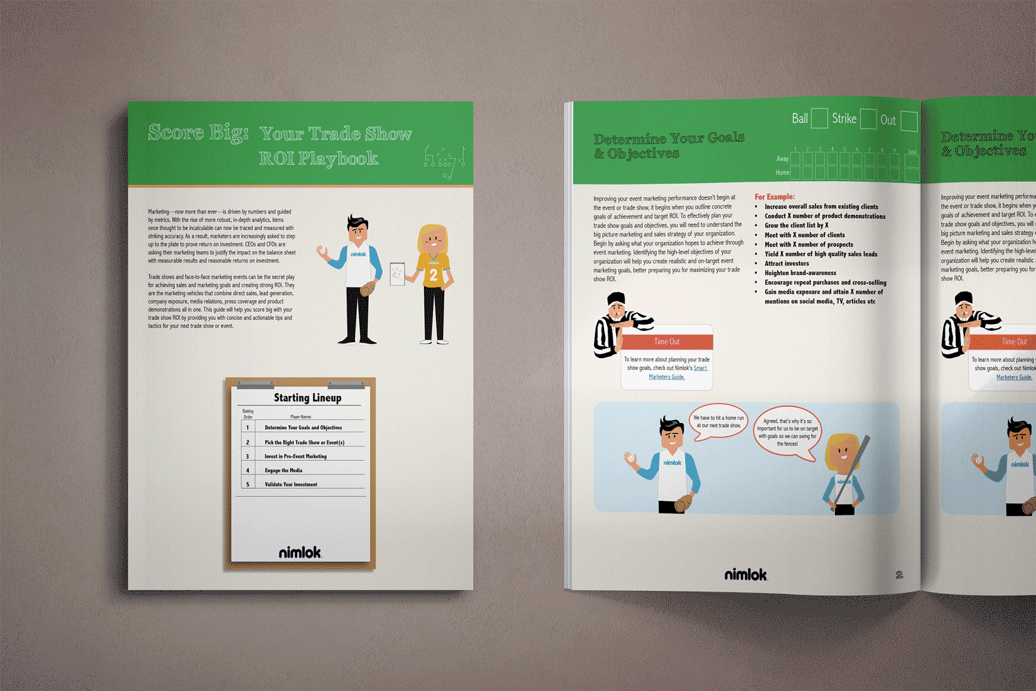
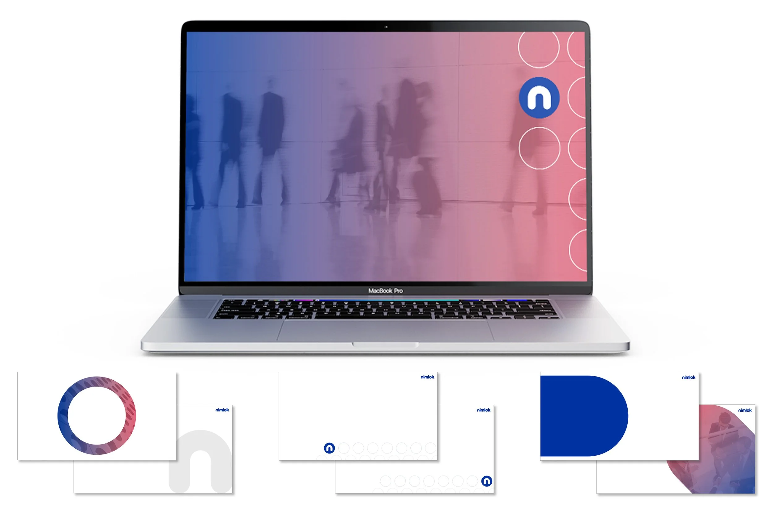
Before → After: Brand refresh shown through updated e-book design
Overview
In preparation for Nimlok’s post-Covid resurgence and following several years of using anniversary branding, the company needed a refreshed visual identity that felt more modern, refined, and confident — while staying true to the brand equity built over decades.
The goal was to simplify and elevate the brand, creating a cleaner, more upscale look that better reflected Nimlok’s role in bringing brands to life through face-to-face experiences.
My Role
I led the creative direction and brand refresh strategy, guiding the overall vision and execution. We leveraged a freelance designer to explore early concepts, which I then refined, expanded, and evolved into a complete, scalable brand system.
I owned the translation from concept to reality — turning ideas into usable, consistent brand assets across digital, print, and marketing channels.
Approach
Audited existing brand standards to identify inconsistencies and opportunities
Clarified what should remain fixed (logo, core brand equity) vs. what needed to evolve
Shifted the visual language to feel cleaner, more modern, and less playful
Reduced visual noise by removing outdated design elements and simplifying layouts
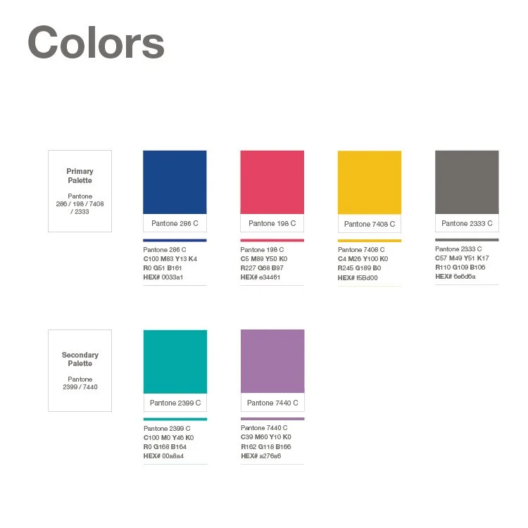
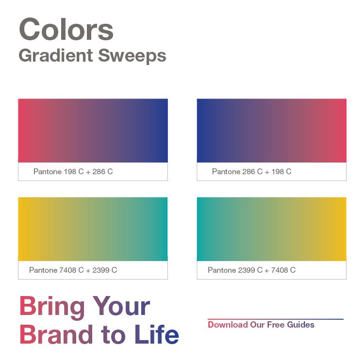
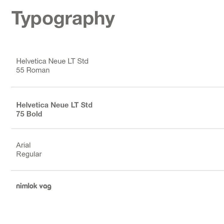
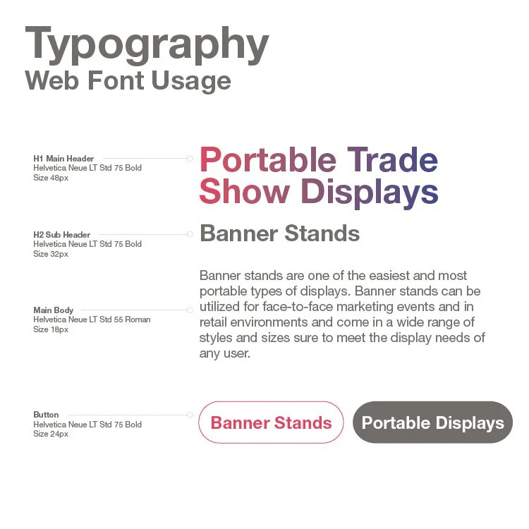
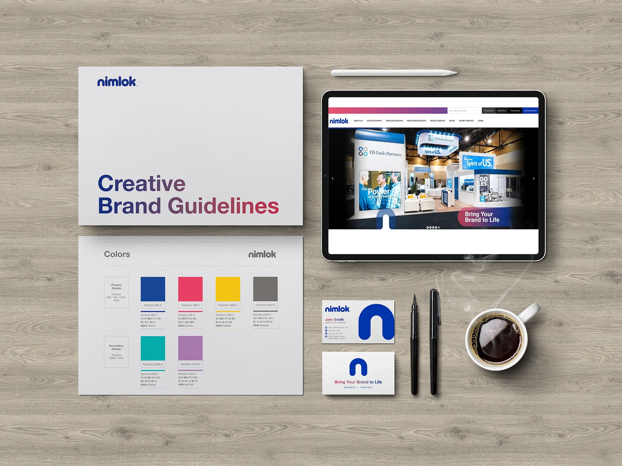
Standardized typography, color usage, and hierarchy across web, email, and collateral
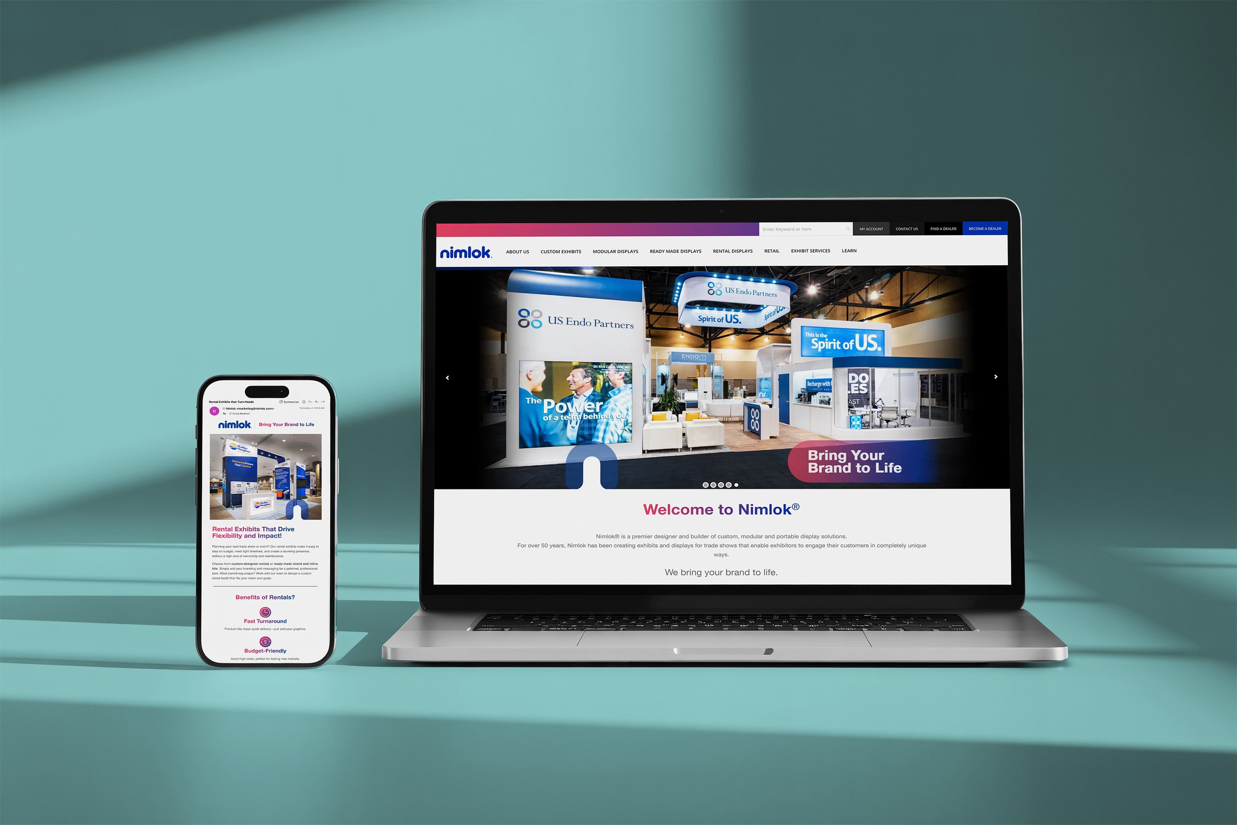
Emphasized large imagery to better showcase Nimlok’s work and capabilities
The focus was on building a system that felt creative and elevated — without becoming corporate.
Outcome
The refreshed brand delivers a more cohesive, polished, and confident identity that better supports Nimlok’s positioning and growth. The new system brought clarity and consistency across touchpoints and provided teams with flexible, ready-to-use assets.
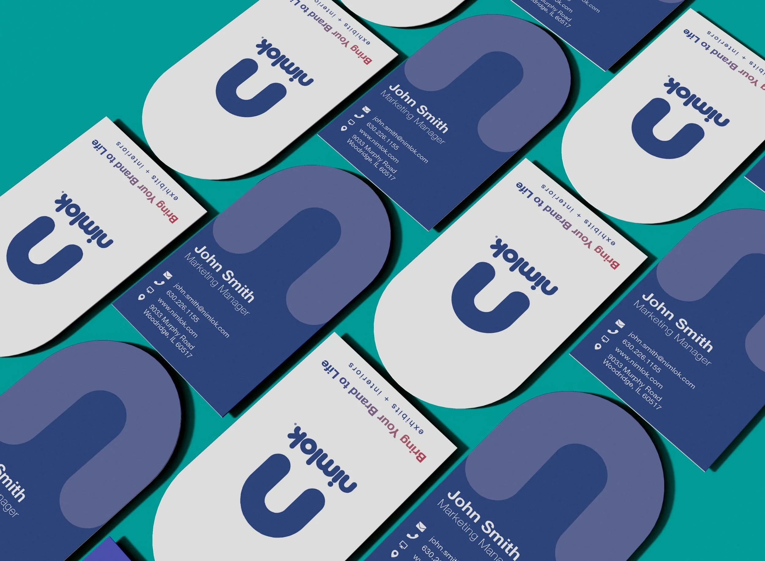
As part of the rollout, I developed:
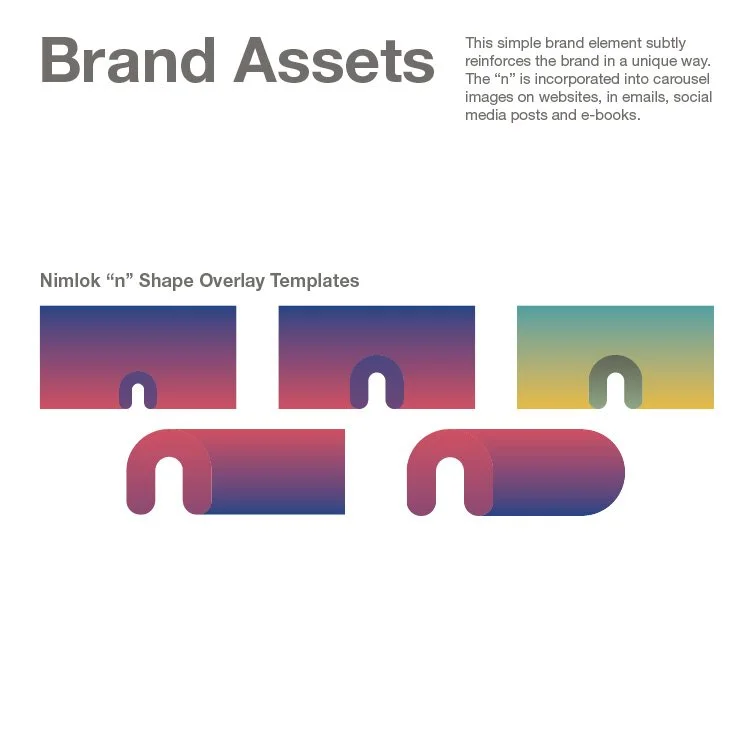
Brand guidelines
Templates and marketing assets
Business cards
Web carousel slides
E-books and supporting collateral
The result is a scalable brand foundation designed to support ongoing marketing, digital, and experiential needs.
A strategic refresh that refined Nimlok’s identity while preserving the brand equity built over 50 years.